Banking App · Case Study
Book 10,000 Fixed Deposits a day — without touching the backend
How rethinking who we were designing for took daily Fixed Deposit bookings from 5,000 to nearly 8,000, using design alone.
Banking App · Case Study
How rethinking who we were designing for took daily Fixed Deposit bookings from 5,000 to nearly 8,000, using design alone.
Overview
A bank came to us with a clear target: grow daily Fixed Deposit bookings from 5,000 to 10,000. The catch — the backend was completely off-limits. Every gain had to come from the experience layer alone.
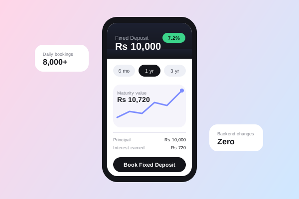
By the end of the redesign, the app was booking close to 8,000 Fixed Deposits a day — nearly double the starting point — without a single backend change. The shift came entirely from designing for the right audience.
Problem
With the backend untouchable, every decision had to happen in the UI. Stakeholder discussions pointed to one "logical" audience, and we built the entire flow around it — landing page, key screens, messaging. It didn't work.
Research
Instead of iterating on a broken assumption, we stepped back and studied real behaviour and data from people actually using the banking app. The pattern that emerged had nothing to do with our original target age group.
The customers most likely to book a Fixed Deposit weren't 35 to 50 — they were 25 to 30. Nothing like we'd assumed.
Ideation
With the real audience identified, we mapped what 25–30 year olds actually needed from a Fixed Deposit journey — different motivations, different trust signals, different pacing — and explored landing page and flow directions built specifically around them, instead of retrofitting the original design.
Designs
We redesigned the landing page and every key screen in the booking flow around the 25–30 audience's behaviour and expectations, then tested the new experience with a small group of customers before rolling it out.
The final booking flow — tenure selector, maturity growth chart, and a single clear call to action.
Lessons
This project reinforced a rule I now carry into every engagement: the biggest UX mistake isn't a version that fails testing — it's designing for the user you assume you know, instead of the one you actually go and research.